AND THEN THERE WERE 3. That would be 3 different logos and 3 different names used by the IAAF since it was founded in Stockholm at the 1912 Olympics as the International Amateur Athletic Federation. The original logo, which lasted almost 90 years, was a monochromatic representation of the winged goddess of victory. In the fall of 2000, a modernized logo “the celebrating athlete” was adopted. At the time, IAAF President Lamine Diack commented, “The athlete symbolizes the core values we all look for in today’s world of athletics: excitement, honesty, authenticity, credibility and global aspiration. This new branding will guide us through the years ahead when we aspire to extend the reach of athletics further, both in number of participants as well as fans.” When we noted the update in the magazine we suggested that perhaps a name change was in order, to something more realistic, like “International Association Of Athletics Federations.” In the summer of ’01, just such a change was effected.
Fast-forward almost two decades and current President Seb Coe said after early-June’s Council Meeting, “The hope is that our new brand will help attract and engage a new generation of young people to athletics. We have now created a brand that can come to life in the digital world while reflecting the changing nature of the sport. And at the same time bring into focus the athletes, the heroes of our sport.”
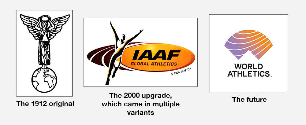
So, pending the approval of the IAAF Congress in September, the sport is poised to change both elements again. Are you ready for “World Athletics,” aka WA? The IAAF release announcing the changes said, “The new name, ‘World Athletics,’ builds upon the organization’s restructuring and governance reform agenda of the past 4 years to represent a modern, more creative and positive face for the sport. The new brand, Council agreed, makes the sport more accessible to a wider audience while giving the global governing body the opportunity to more clearly communicate its mission as the leader of the world’s most participatory sport.” Says new CEO Jon Ridgeon, “The IAAF name has been in existence for over 100 years, but it has little understanding or relevance to those outside of athletics. The new identity creates a symbol that can stand alone and work with partners and events.”
In explaining the look of the new logo, the IAAF release said, “The logo design is comprised of three main elements: the ‘W’ of World, which is also a symbol of an athlete’s arms raised in victory; the ‘A’ of Athletics, which also represents an athlete’s focus as they prepare for the road ahead; and an arc over both to represent the entire athletics community coming together. The logo also includes the sweep of a running track which appears in an upward trajectory, symbolizing the desire to continually push beyond limits. The patterns capture the energy present in all four of athletics’ group disciplines: running, jumping, throwing and walking.”
Editor E. Garry Hill has a few thoughts about the changes which will appear in our compiled June issue, coming this week.

