OK, SO HERE’S THE DEAL. I have been watching track & field long enough to remember when innovation was a digital stopwatch on the screen “accurate to within 2-tenths of a second!”
So when World Athletics promised to reimagine the sport, yet again, for its first Ultimate Championship in Budapest, I approached it with the open mind of a longtime track fan. Meaning I was hopeful, curious and fully prepared to groan and nitpick.
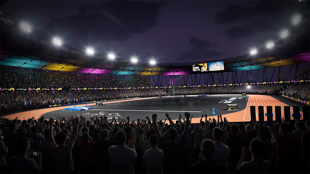
Then I saw the track. I could almost hear Jan Hammer pounding the keys of his Minimoog. Color-scheme-wise, we were riding shotgun with Crockett and Tubbs on Miami Vice. (For those too youthful to have memories of the ’80s, think Grand Theft Auto: Vice City.)
The infield was black, like a freshly poured grocery-store parking lot. The graphics glowed with vivid pinks, teals and Barney-the-Dinosaur purples. And hold the rotary phone: even the long-jump sand was pink.
And you know what? I liked it.
The graphics were a refreshing change. They fired plenty of data at us, but nowhere near the eyeball assault of an MLB broadcast. At the last Texas Rangers game I attended, it took me an inning or two just to find where the number of outs was hiding amongst probably 14 different stats.
But back to the track. Or the field, as the case may be.
The tar-black infield caused some internal conflict for me. On one hand, I am a purist. Deep down, I believe a field should be, well, a field. Grass is green. Tracks are red (Budapest got this right). American football fans are familiar with Boise State’s blue field, which is memorable, undeniably kitschy and about as true to the sport as ranch dressing on sushi.
But Budapest’s black was intentional. WA designed the infield so the active competition areas could be brightly lit, directing attention toward the event in progress. On television, it worked. The dark background made the track, implements, graphics and — most importantly — the athletes pop.
Track & field has never had a shortage of color: national uniforms, shoes, flags, hair and the extraordinary circus of athletes assembled in one stadium. Budapest didn’t add color to the sport. Like a black ’80s concert T-shirt, it gave all that color a place to pop.
Sports-television innovations range from the sublime to the wack-a-doodle silly. On one end is my Bowerman Award of TV graphics: the yellow first-down line (apologies again to non-American football fans). Introduced in ’98, it solved a problem so clearly that new fans now expect to see it live in the stadium.
Then on the less enduring side there was FoxTrax, the glowing hockey puck of the late ’90s. Its halo and comet tail made hockey look like a Saturday-morning cartoon.
That is the line every broadcast innovation has to walk: Does it help level things up for the viewer, or does it just shout, “Hey, look at me, I’m a hockey puck comet tail”?
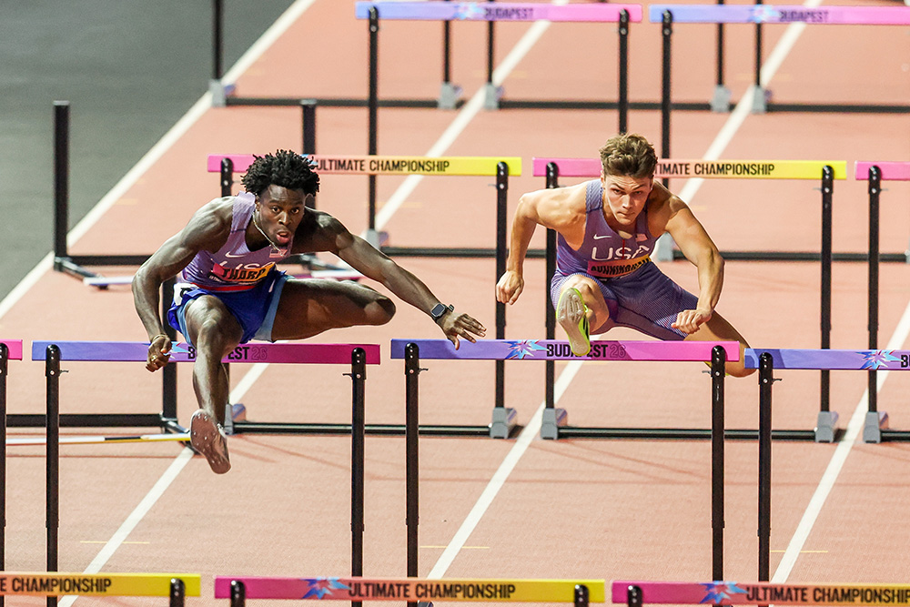
For the most part, Budapest stayed on the correct side of that line. Athlete headshots, rankings and new data were integrated without making the screen resemble an air-traffic-control panel.
The lane introductions looked different, too. As a hobby sports photographer, I noticed what appeared to be a wider aperture and shallower depth of field than we usually see in a track broadcast. The athlete stayed crisp while the stadium fell softly away, almost like a portrait session. For a few seconds, the athlete was the whole picture. Slow clap for that.
The in-motion camera work felt different too. Presumably lots of drones flying around the stadium giving us fresh and dynamic angles. Occasionally, they spent too much time in close for my taste, as it became a little hard to tell where they were on the track (but, of course, there was an on screen graphic that did just that).
My favorite new toy may have been Sony’s optical-tracking visualization of the finish for replays of sprints. As runners crossed the finish-line plane, the image captured and held them there in 3 dimensions. It was useful, dramatic and candidly reminded me of Han Solo being frozen in carbonite.
The broadcast would also share “predicted finishes and live win probabilities.” This seemed to be designed at the intersection of two audiences: the exploding sports-gambling crowd and the stat geeks who have always populated track & field. By the way, I use “stat geeks” lovingly. These are my people.
But then came the illogical blip of all blips. The graphic next to Josh Kerr projected a 13th-place finish in the men’s 1500.
THIRTEENTH?
Um. No. This is the newly minted WR holder in the mile. In the loaded, and tactical, Commonwealth Games mile 6 weeks ahead of Budapest, Kerr had finished nearly 10m ahead of the field. Sorry, algorithm robots. That dude’s not “expected to finish 13th.” Spoiler alert: Kerr won the thing. Crockett kept the Ferrari in park.
The percentages could give viewers another reason to lean in, but that Kerr projection made it wildly clear that something inside the model needed work. I put some AI robots to work to see if they could find a published list of all these predictions, and World Athletics does not appear to have published them, so I’ve as yet been unable to check their overall accuracy. They may have been insightful. But Kerr in 13th? C’mon.
Which brings me to another track-nerd nitpick: Uhhh, wind speed?
Show me the win probability. Show me the projected finish. Show me a digital sprinter streaking through a neon grid. Show me winning time (to be slightly adjusted of course moments later). But, please, also show me “+1.7.” Or, heaven forbid, “+2.1.” The future and the fundamentals of track & field can coexist.
The presentation worked best when its showmanship revealed more of the athletes. They had proudly introduced red-carpet arrivals letting the athletes strut down a paparazzi runway wearing clothes of their choice. They posed for photos and displayed personalities usually compressed into a few seconds behind the starting blocks.
That may sound peripheral, but it is central to growing the sport. We live in a vertical-video world of TikTok, Reels and 6-second bursts. A red carpet generates material athletes can share and fans can discover.
World Athletics also made footage and photography available for athletes to use on their own channels. This is smart. If you want fans to care about athletes, help the athletes tell their stories.
I just saw there’s a new reality show to find the next big name in Olympic wrestling. C’mon, T&F, that’s the lane we need to be in, too.
Oh, and then there was Mondo Duplantis singing the meet’s official anthem, Gold. Because apparently being the greatest pole vaulter and marrying a Swedish model still left holes in his résumé.
Track fans have been down this road before. In ’93, Carl Lewis sang the national anthem before a New Jersey Nets game. He started too high, his voice cracked, and he interrupted himself with an “Uh-oh” before promising, “I’ll make up for it now.”
He did not.
His performance to this day remains in the pantheon of all-time anthem abominations.
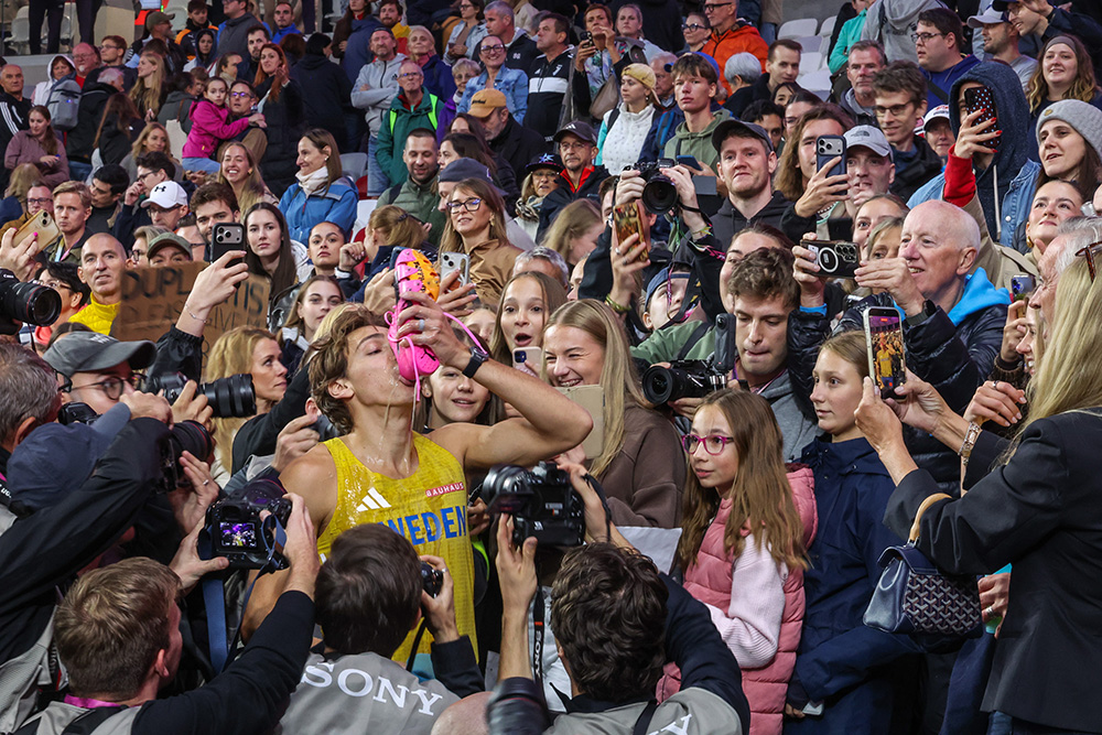
So, with this in mind, I was fully prepared to despise Gold. Then I listened — watched the YouTube video. And I gotta say, the tune kinda slaps. And hey, if the song sends a few listeners toward the pole vault, bring it on.
Small side note, more consistency than news: I liked the announcers. Anyone who spent time on the old Track & Field News message boards knows announcer criticism was the white noise that never left. Rest in peace, message boards. I miss you.
Here’s the thing I’ve always believed and adored about track & field. At its core, track should be unbelievably simple to watch. If two guys at a bar let the conversation deteriorate into “I bet I can beat you to that tree,” nobody needs a primer or a rulebook. The first guy to the tree wins. You get it.
But easy to understand is not the same as interesting to care about. Olympic broadcasts have often attacked that problem with the full “Up Close And Personal” treatment. Today, people consume stories in seconds, not minutes. Give us just enough to know who the athletes are, what they are known for and why this race matters.
This announcing team sounded like people who genuinely love the sport. They made the outcomes matter more without making the race to the tree feel complicated. Or fluffy.
Speaking of fluffy, Budapest seemed to take the all-time lead in providing comfortable chairs for field event athletes. I’m good with that. Treat the studs like the thoroughbreds they are.
The 3-day schedule moved briskly, introductions were tight, and the production seemed to focus attention on one field event at a time, and gave my beloved field events above average air time. Track meets contain natural drama, but traditional presentations often bury it inside dead time and simultaneous action.
I can’t not mention track’s most recent big swing, Grand Slam Track, which arrived promising innovation but collapsed amid the disappointment of athletes not getting paid. I never liked that it skipped the field events, but here’s hoping none of the athletes excelling on teal and pink have any trouble cashing their checks.
Not every Ultimate innovation needs to survive. The probability model clearly needs help. The black infield may become a signature, or someday resemble an exceptionally athletic cosmetics counter. But this is what a new championship should do: try things while honoring its promises.
For years, track fans have asked why our sport cannot capture more attention outside the Olympics. Budapest offered part of the answer. Make it easy to follow and visually distinctive. Let athletes show personality. Create content for the screens people use. Pay the competitors like stars. Keep the pace moving.
And please, show the wind speed.
Do those things, and even a purist like me can live with the pink sand and black grass.